I had so much fun working on Zoe’s photoshoot. Why? Because the product itself is visually appealing, and its target audience is women—a focus I really enjoy capturing through photography. But what exactly is Zoe, and how did I choose the aesthetic for this project?
Zoe is an anti-chafe solution specifically designed for women. In the world of anti-chafe products, many options come in the form of deodorant sticks. While these can work for some areas, Zoe offers something more versatile. Its liquid-to-powder formula glides on smoothly like a lotion and dries to a silky, moisture-absorbing powder that can be applied anywhere on the body. This unique formulation gave me the creative freedom to highlight a product that is both practical and elegant.
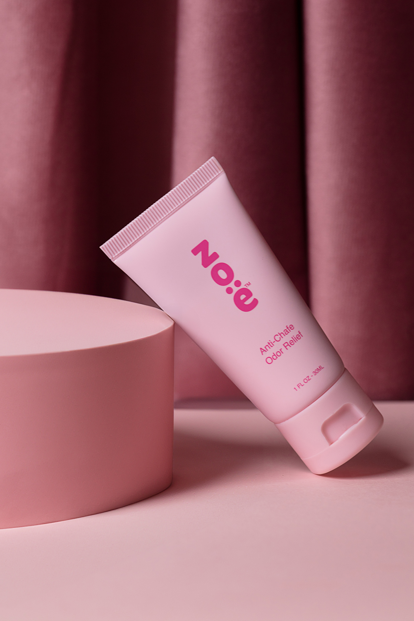
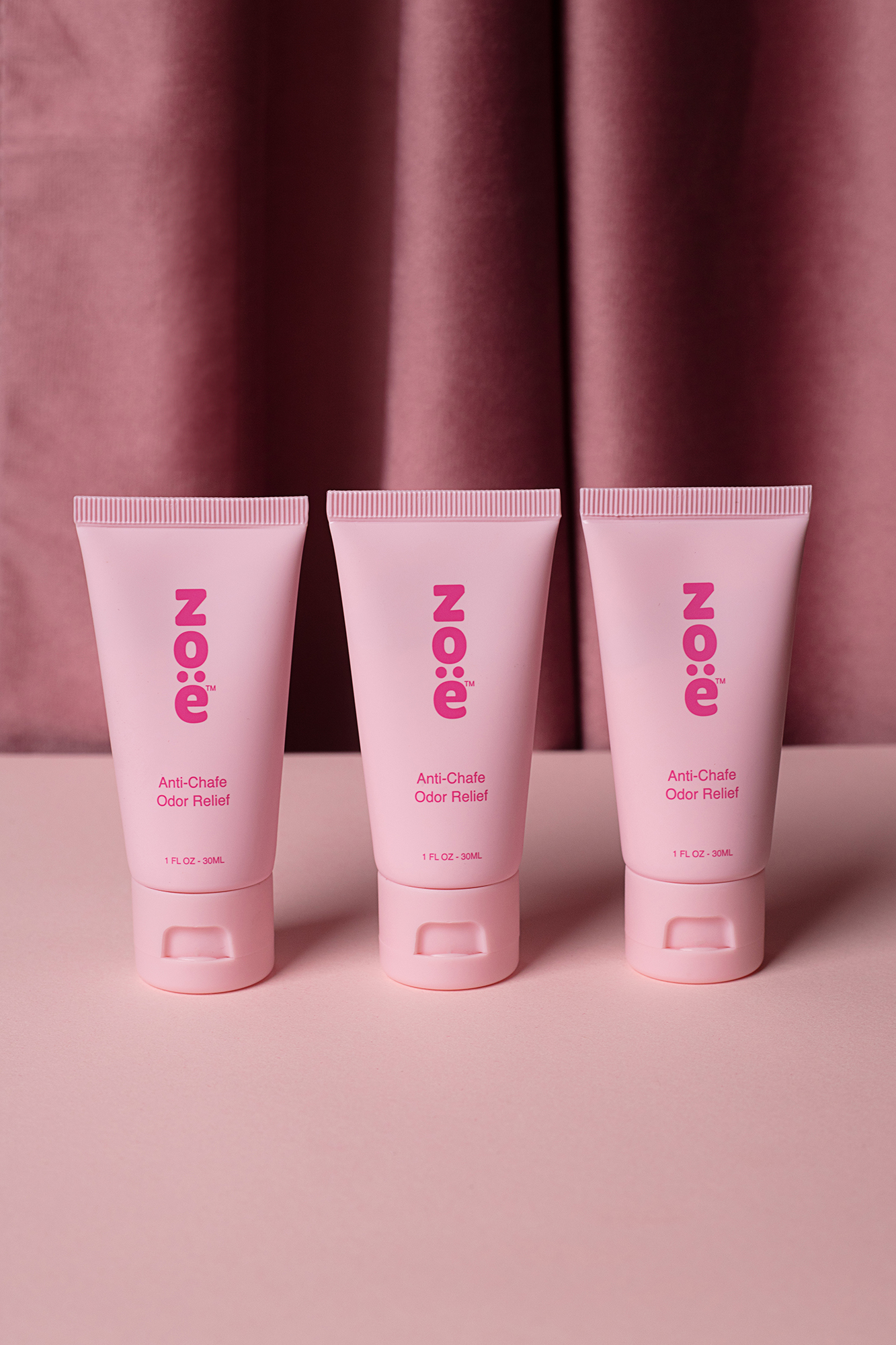
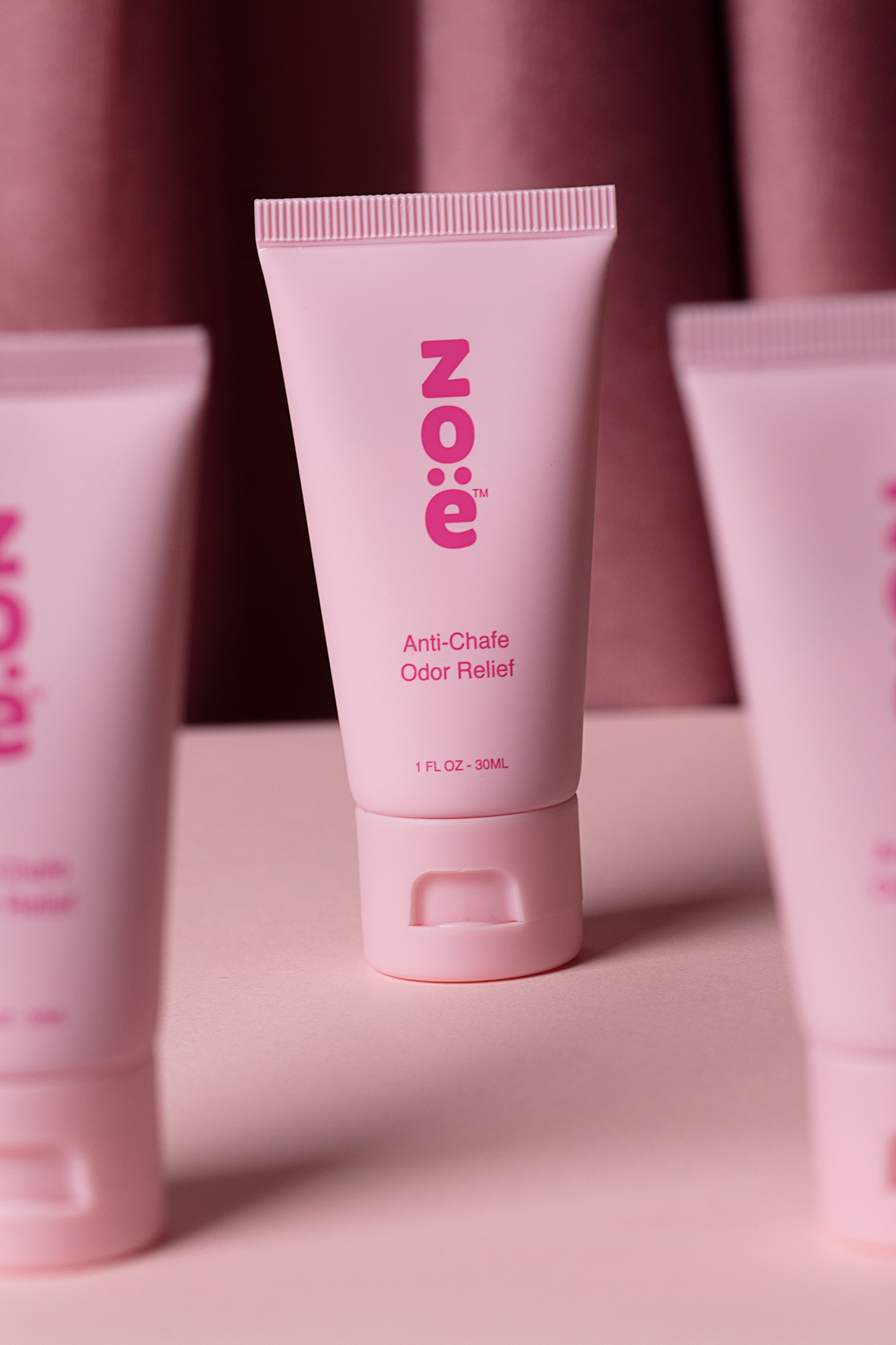
Once I understood the brand and its audience, I focused on creating a visual style that reflected Zoe’s identity. The brand is feminine, approachable, and modern, so I chose pink as the main color to represent these qualities. I used a soft, dark pink curtain as a backdrop to make the product stand out while also evoking the feel of a girl’s room or bathroom. This approach created a natural, relatable environment that complements the product and appeals directly to the target audience.
Working with Zoe was an absolute pleasure—the packaging is already eye-catching, which made the editing process smooth and enjoyable. I aimed to highlight the product’s elegance and functionality while keeping the images cohesive, visually appealing, and brand-aligned. Every shot was designed to feel natural yet polished, showing the product in a way that feels both aspirational and approachable.
Overall, this project allowed me to combine creativity with strategy, translating Zoe’s unique qualities into visual storytelling that resonates with its audience. It’s always rewarding when a product’s personality shines through in every image, and Zoe was the perfect example of that.